
What is Domo?
Domo is a powerful cloud-based solution that combines data integration & warehousing, business intelligence (BI), and application development in a single platform.
What data sources does Domo connect to?
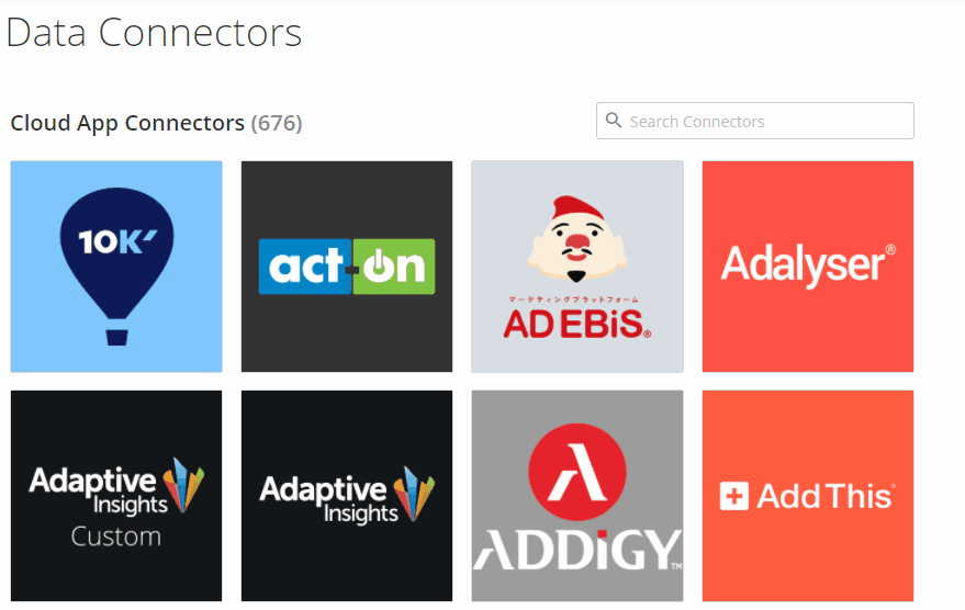
Out of the box, Domo connects natively to many different cloud-based data sources. At the time of this writing, Domo has over 700 connectors built. Some of these are different connectors to the same parent data source, but this is still a lot of different data sources to connect to. Some examples are below:
Advertising & Marketing
Google Ads
Facebook Ads
YouTube
Criteo
AppNexus
Adobe Analytics
Google Analytics
Amazon Advertising
Snapchat Ads
Others
Databases
Amazon Redshift
Amazon Athena
MySQL
PostgreSQL
SAP
MongoDB
Snowflake
Vertica
Others
Structured Data Sources
CSV (upload or connect to HTTP/FTP/SFTP)
Excel (upload or FTP/SFTP)
JSON & XML (connect to HTTP)
Public Data Sources
Bureau of Labor Statistics
Bureau of Economic Analysis
OpenWeatherMap
Open Exchange Rates
NOAA
NHTSA
Others
CRM & Business Apps
Salesforce
Hubspot
Quickbooks
Freshbooks
ADP Workforce Now
Jira
NetSuite
SugarCRM
Box
Xero
Others
Domo can also connect to on-premise/local data sources through its proprietary Domo Workbench tool.
In addition to native and on-premise data connections, Domo has a developer platform that allows you to build a your own custom connector. This is helpful in cases where a particular Domo connector may not have the exact information you need, but said information is available via an API call.
Why is Domo great?
Sometimes when tools attempt to do a lot of things, they end up doing none of them that well. Domo is an exception to this rule. Your entire BI/Reporting/Analytics stack can live within Domo. The platform can be your one-stop shop for:
Connecting to all of your data sources
Storing that data that you've connected
Preparing that data using MySQL, Redshift, or Domo's drag-and-drop "Magic ETL"
Visualizing that data using one of over 150 different chart types or building your own custom visual or app
Analyzing valuable data segments using custom filters, selectors, and drill-downs
Detecting and communicating anomalies through Domo alerts
Sharing reports and visuals through automated email or embedding in a web page or document
How do I get started?
Domo does have a free trial where you provide your contact information and then you're able to use the platform for a limited time.
There is a bit of a learning curve with the platform, but Domo has great training materials and guides to get you started with connecting, preparing, and visualizing your first dataset. The user community (known as The Dojo) is also a great resource for learning after you start using Domo.
What data can I visualize with Domo?
As mentioned above, you can connect to and visualize data from just about any data source you have. In addition, you can easily bring in public data to overlay with your business data. For example, if you sell rainwear, your business is likely impacted by the weather. You can easily connect to data via one of Domo's NOAA or OpenWeatherMap connectors.
Enrich your business data by bringing weather data into Domo
You could then connect to your Google Analytics transaction data.

What are some useful features?
Built-in ETL + Data Warehouse = One-stop Data Shop
The fact that Domo is a one-stop shop for your data needs is a useful feature in itself. This means that you don't have to build a huge stack with many different providers in order to move, visualize, and use your data. Domo's Magic ETL allows users to combine and process multiple complex data sources in order to produce a single dataset without writing a single line of code.

Magic ETL is where you can combine and clean data in one multi-step process.
Calculated Fields (Beast Mode!!!)
Calculated fields is a pretty standard feature in all reporting and visualization tools, but Domo's Beast Mode is very powerful. It can handle re-aggregation of fields inside a nested CASE statement as well as some window functions typically only found in a SQL-based database environment. In 2020, Domo released the Beast Mode Manager which keeps all calculated fields in a single location within the user interface. This allows for ease of management of those fields so you do not have to be working inside a specific visual in order to create calculated fields. For example, if I need to calculate 10 different fields on my dataset I can easily do so before creating a single visual.
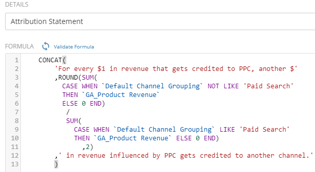
This is an actual Beast Mode calculation that is used to write a sentence that states “For every $1 in revenue that gets credited to PPC, another $X.XX influenced by PPC gets credited to another channel.”
Drill-down
Domo allows you to drill down to view a particular data segment on just about any visual. For example, if you have a map visual displaying lead volume by US state, you could potentially click on Florida to see a map of leads by county or a bar chart displaying the number of leads driven per media channel. This is a completely customizable feature that often gets overlooked.
Alerts
In a true, enterprise-level BI platform, alerts is a must-have. Individuals or groups can be alerted if a metric:
changes by a certain percentage
Reaches a specific value
Is zero (useful in indicating data missing due to potential connection failure)
Alerts can be sent via:
Email
Mobile push notification
Text message
Phone call
Some practical applications of alerts:
Marketing launches a new digital ad, but that ad is not categorized - be alerted that you need to classify new entities
Website traffic drops by more than 20% in a given day - be alerted to negative SEO impacts from a recent Google update
Revenue drops to zero for a high-volume hour of the day - be alerted that you need to look into a potential problem with your Order Management System
Enterprise security
There are many security features within Domo that should remove fear of data getting into the wrong hands or viewed by the wrong people. Some of these features are below
Filter a dataset in order to restrict access for certain people to only see certain data on a shared dataset
Create access groups so that users can only see certain dashboards or filtered data on a shared dashboard
Single Sign-On & Open-ID Connect (SSO) compatibility
Enable multi-factor authentication
Restrict access by email address domain
Create & manage a whitelist for connected applications
Desktop software & plugins
Sometimes you need to email a report to someone within a specific template. Domo makes this super-easy through its Word, Excel, and PowerPoint plugins. For example, if you use the Word or PowerPoint plugin, you can add refreshable visuals to your templated document. If you use the Excel plugin, you can connect a spreadsheet to any dataset in your Domo instance and then download that data on demand.
Domo's Workbench software is a powerful and reliable solution for uploading data to Domo. Sometimes API connections fail, so you need a solution that will reliably and securely upload data from a server or personal machine to Domo, and Workbench does just that. You can use it to upload files from the following sources and formats to existing or new datasets:
Excel
CSV
JSON
Quickbooks
Database Query
SFTP/FTP file transfer
ODBC & OLEDB Connection
XML
Developer Platform & App Store
Many companies have utilized Domo's developer platform in order to create custom apps for both internal and commercial use. Some solutions built on the Domo developer platform include apps for measuring sales pipeline velocity, SAP order and vendor management, and contact center performance management. These solutions are available in the app store, but if none of these pre-built configurations meet your needs, you can generate a developer token and get started creating your own app and/or connector.
User Management & Activity Log
Domo's interface allows you to manage users access, group memberships, and permissions in a single location. Users can be imported in bulk which can be useful when managing hundreds or even thousands of users. In addition, admins can view and visualize user activity. This information is critical when getting people to adopt and engage with Domo so that you can talk with your users who rarely log in and have your frequent users become internal evangelists for the platform.
What are some limitations?
Steep Learning Curve
Domo is a great platform for centralizing and democratizing data, but it can be a bit daunting for new users. Old habits die hard, so there will be a challenge in getting some less-tech-savvy folks in your organization want to use the platform. It is best to have someone in the organization who is familiar with SQL and data structure in order to set the proper expectations and govern the instance accordingly.
Metric Comparison in Tables
For all that Domo does right, the lack of out-of-the-box metric comparison for some visuals can be frustrating. It is not currently possible to change time periods for metric comparison on the fly. For each metric in a table, you'd have to create a metric that is filtered to a specific date range (i.e. previous 7 days, last month, last year, two years ago, etc.), and disallow the user to select her own date range. When you have lots of metrics to look at and many different datasets, this can get very tedious very quickly.
Too Much/Never Enough
Some data connectors are mature, some are not fully baked, and others have multiple versions. In the latter case, it can require a lot of trial and error to find the correct connection that gets you the data you need.

Which Facebook connector will get me the data I need?
Is Domo right for me?
If you're asking yourself this question, chances are that Domo is a solution worth evaluating. If any of the below statements apply to you, it's definitely worth at least a look:
I currently email spreadsheets back-and-forth
I handle millions of rows of data but do not have a large team/infrastructure already in place to handle data
I don't have any automated reporting solution in place
I have a BI/reporting solution in place, but we've outgrown it
I have data from multiple systems that need to be pulled, compiled, aggregated, visualized, and analyzed quicker than I can currently handle
I would like to automate my reporting, but don't know where to start
I would like to automate my reporting, and have a budget to do so
If any of the above are true, or if you tried Domo but got lost, Fusion75 can help. We are a Domo go-to-market partner and can help you get things set up quickly. Don't hesitate to fill out the form or contact us via chat!