
What is it?
Google Data Studio is a free data visualization tool that allows users to build dashboards and easily share those dashboard with others.
What data sources does it connect to?
Out of the box, it connects natively to many different data sources
Google-Owned Products
Google Ads
Google Analytics
Google Sheets
YouTube
BigQuery
Google Campaign Manager
Google Ad Manager 360
Display & Video 360
Search Ads 360
Google Search Console
Google Cloud Storage
Google Cloud Spanner
Databases & File Uploads
MySQL
PostgreSQL
.CSV file upload
In addition to native connections, Google Data Studio has 200+ connectors developed and maintained by partners that allow you to connect directly to a number of sources including:
Facebook Ads
Facebook Page Insights
LinkedIn Ads
Microsoft Advertising (Bing Ads)
CallRail
AdRoll
Amazon MWS
AppNexus
Centro
Choozle
Constant Contact
Criteo
Hubspot
Quickbooks
And more
Why is it great?
Over the years, great data visualization and reporting automation tools have had high barriers to entry. Typically you'd need a large budget to cover not only the cost of a tool (or a whole stack of tools), but also the salary of the people maintaining it. In addition, it could take months or years to begin to see any value from your steep investment.
On the other hand, the cost of continuing to maintain large, complex spreadsheets is a cost that companies can ill-afford to keep paying. Sunk hours of downloading, copying & pasting, and updating vlookups for ad-hoc reports could be better spent using data to make decisions.
Google Data Studio is FREE. As long as you can supply the data, Google will let you visualize it in their tool for no additional cost. Also there is no cost to share your data with anyone who needs to see it.
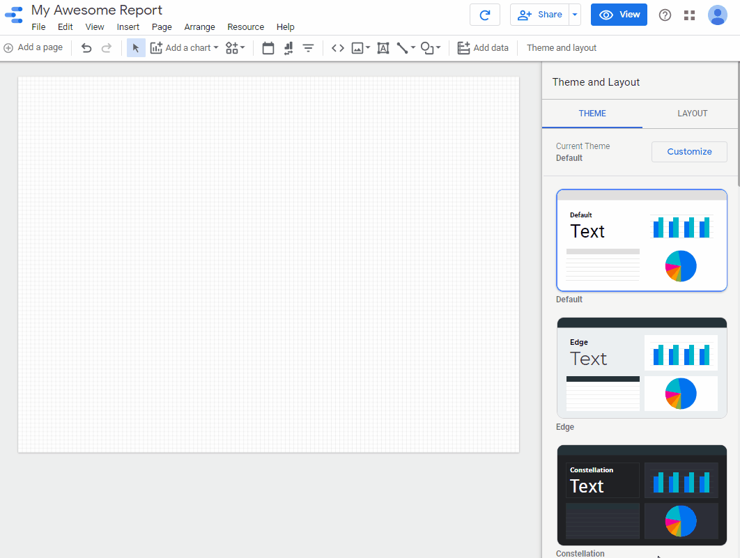
Google Data Studio is familiar and highly customizable. Many other tools (paid & free) may offer a lot in terms of features and power, but you're stuck with a rigid template or have to be a coding wizard in order to get your dashboard to look the way you want. Rearranging and customizing the look and feel of your Google Data Studio dashboard is as simple as dragging, dropping, re-sizing, and changing fonts & colors as you would do in a PowerPoint (or Google Slides) presentation. On top of this, you can easily add drop-down filters and date range selectors for users to interact with the data on their own.

Re-arranging your report is as simple as drag-and-drop.
How do I get started?
Simply go to Google Data Studio, connect to a data source, and create a report.

If you have any familiarity with Pivot Tables, or with tools such as Tableau, Domo, and Power BI, the interface should look similar. You select your desired visuals, and then drag and drop fields until your visual accurately communicates your story.
What data can I visualize with it?
As mentioned above, you can connect to and visualize data from just about any data source you have. The Google products integrate seamlessly without much manipulation required, and then if data is prepped in an external database somewhere, it can easily be connected and visualized within Data Studio.
Need to display how many views your YouTube channel gets daily? Use the YouTube connector and create a trend line.
Need to know Cost per Conversion for each of your Google Ads campaigns? Use the Google Ads Connector and create a bar chart or table with those metrics.
Need to track spend vs. budget for your DV360 campaigns? Blend your DV360 data with your budget in a Google Sheet and use a Gantt chart from the community visualization library.
Have a mobile app powered by a PostgreSQL database? Use the PostgreSQL connector and create a map showing what states or countries your new users are coming from.
The bottom line, is that as long as you supply the data and structure it properly, Google Data Studio can help you visualize it.
What are some useful features?
Sharing and embedding
All reports created in Google Data Studio can be shared in the same way that any user can share a Google Doc or Google Sheet. Simply click the +Share button, and select whom you are sharing the report with. You can also make any report accessible to anyone who has the link.
All reports can be embedded on another site or in an internal web application.
We've created a client-facing report for a company who provides information to clients behind a secure login.
Calculated Fields
This one is a pretty standard feature in all reporting and visualization tools, but Google Data Studio keeps all fields (calculated and non-calculated) in a single location on the dataset. This allows for ease of management of those fields. For example, if I need to calculate 10 different fields on my dataset I can easily do so before creating a single visual.

Creating a calculated field is simple in Google Data Studio
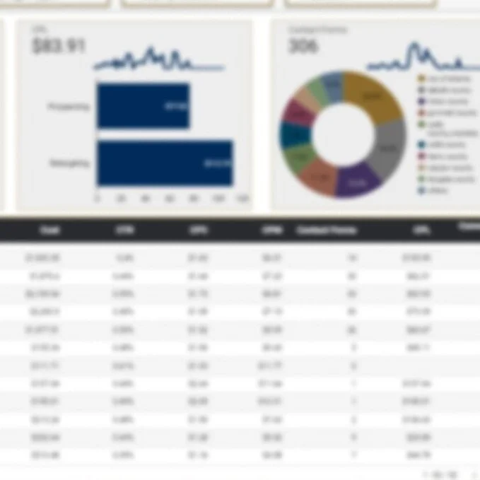
Drill-down
Google Data Studio allows you to drill down to view a particular data segment on just about any visual. For example, if you have a table with performance grouped by week, you could potentially drill down to see data by date for a particular week or data by date for all weeks in the table.

Drill down from week to date, category to sub-category, etc.
Row-level security
This is an enterprise-level feature hiding inside a FREE tool. You may have a dataset that contains data for multiple clients, but you only want client A to see client A's data. By adding a field containing client A's email address on client A's data, if client A is logged into her Google account with that same email address, she can only see her data. If she's not logged in, she will not see any data.

Include a client’s email address in your dataset in order to maintain security while achieving scalability.
We actually utilized this feature on the same embedded report mentioned above so that multiple clients could access the same report but still only see their own data.
Metric comparison
In 2020, some PAID tools still do not offer an easy way to do metric comparisons out of the box. If I wanted to create a table showing this month's data and then show the percent change vs. the previous month, I'd have to create a bunch of CASE statements and not allow for changing date ranges, etc. Google Data Studio absolutely knocks this out of the park. We can simply select "Previous period" from a drop-down menu, and BAM! You can even get fancy and choose to not compare certain metrics within your table.

Comparing metrics over time is simple.

Change your date range, and see that both the metric and the comparison numbers change.
Community Visuals
A number of third parties have created cool and useful visuals that live outside the realm of what Google has already created for us. Gantt charts, sunbursts, metric gauges, radar charts, and more already exist and can be added to any report you create, and if you don't see what you need, you can develop it yourself!

What are some limitations?
ETL not Included
Google Data Studio is solely for visualization. It does not include an ETL tool to prep your data, so if you're combining data from multiple sources (i.e. Google Ads, Facebook Ads, and Google Analytics) into a single dataset, you'll need to do your data prep work elsewhere. While this in itself is not a bad thing, it is noteworthy for expectation setting.
Fusion75 uses tools such as Xplenty and BigQuery for prepping data prior to visualizing it in Google Data Studio.
Alerts missing
While Google Data Studio is awesome for reporting and visualization, it falls short of being a full-fledged business intelligence tool. For example, a platform like Domo can proactively send alerts stakeholders via email, text message, and push notification if a particular metric changes by a certain percentage.
Drill-down customization
This one is nuanced and may not be a big deal for the vast majority of users, but when drilling down on a visual, you cannot drill down to another type of visual. For example, if I wanted to click on a single week in a table, and have the resulting drill-down be a pie chart breaking down traffic by device type, I would not be able to do so. I can only drill down to another field within that same table.
Manual Refresh
There is no real-time auto-refresh. This one is not a huge deal, because the manual refresh is one click, but if you're dealing with real-time data, you may not want to have to keep clicking the refresh button. Some third-party developers have developed an auto-refresh solution that refreshes the report on user-defined intervals (i.e. 5 seconds, 1 minute, etc.), but these solutions are not maintained by Google and could potentially stop working after a platform update.
CASE Statement limitations
With calculated fields, you cannot include a function or reference an aggregated field inside your CASE statement. Some paid platforms allow you to do this, but Google Data Studio does not. You can, however, create a non-aggregated function and reference that field within a CASE statement, but there is no solution for aggregating a metric within the WHEN clause of a CASE statement.
Is Google Data Studio right for me?
If you're asking yourself this question, chances are that Google Data Studio is a solution worth trying out. If any of the below statements apply to you, it's definitely worth at least a look:
I currently email spreadsheets back-and-forth with clients and/or my internal team.
I don't have any automated reporting solution in place.
I have a reporting solution in place, but it's very rigid and reporting views are not able to be customized.
I like Google Drive/Docs products and wouldn't mind a user interface similar to those interfaces.
I would like to automate my reporting, but don't know where to start.
I would like to automate my reporting, but don't have an enterprise budget.
If any of the above are true, or if you tried Google Data Studio but got lost, Fusion75 can help. Don't hesitate to contact us!
